Monday, December 10, 2007

Final Project...Done!

Below is my finished final project map. All in all, I'm very happy with the way it turned out. Click on it to open up a page with an enlarged version of the map on its own.

Big Version...


Little Version...

Links to websites relating to my map...

http://tti.tamu.edu/
This is a link to the Texas Transportation Institute of Texas A&M University. TTI's website is actually where I found my data that I used for my map.

http://www.dot.gov/
United States Department of Transportation

http://www.energy.gov/
United States Department of Energy

http://www.eere.energy.gov/
U.S. DOE Energy Effeciency and Renewable Energy

http://www.fueleconomy.gov/
A collaboration between the DOE and EPA

http://www.publictransportation.org/
American Public Transportation Association

http://www.metro.net/default.asp
Los Angeles County Metropolitan Transportation Authority...LA had the highest value for fuel consumption due to traffic.

http://www.theonion.com/content/video/tired_of_traffic_a_new_dot_report
Of course, traffic is obviously a problem for numerous reasons, but thanks to one of the most credible news sources around there is a solution! ;)

Friday, December 7, 2007

Classmates Maps and Examples...

Well the class blog says we had until yesterday to do this post, but I'm pretty sure I saw on the board in the geography lab that we have until today (Friday) to do it, and its still Friday so here it is...

Classmates Maps...


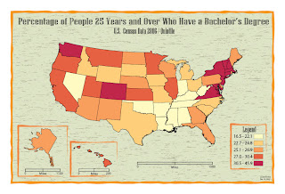
I really like Louis's color choropleth map. He was the only person to use a background other than just a gradient or some color or another. The neatlines and borders he used are really cool too.


The symbol David used for his Bivariate was a really good choice. I liked the green background too. My only gripe was that if your going to make some of the symbols transparent, you should do it with all of them. But its still a really cool map.


Sewitt's color choropleth map was really cool too. I liked the black background with the neon yellow/green fonts. The map reminds me of Mountain Dew too...which of course is like the best drink ever made...so thats got to count for something!


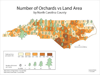
Besides all the white space in the bottom right part, I think Leanna's bivariate map was done really. I really liked the tree symbol she used and it worked well with the colors she chose for the choropleth part. Cool map.


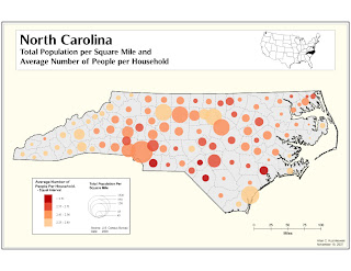
The layout on Allan's bivariate map was done exceptionally well in my opinion. I also liked the map inset in the top right corner. His was the only map all semester I saw someone do that. I wish the fill for the states was a little darker and some of the legend is a little hard to read, but nonetheless a very nice map.

Others had some really cool maps as well, I liked Justin's map with the cones, Martha's with the outhouses, Ashley's corn map, and numerous others...but I'm not going to post all of them.

Classmates Examples...


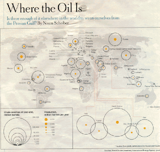
The "Where The Oil is Map" Justin posted seems to be a class favorite. I have to say I agree.


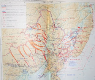
I can't read the damn thing but I thought the Russian military map Martha posted was pretty cool too.


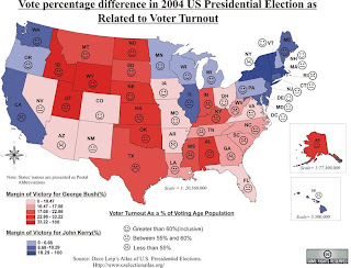
I like the election map Louis posted on his blog. The way the faces are used to show voter turnout is pretty neat.


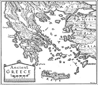
This Ancient Greece Map Leanna posted is really interesting too. I like the fonts as well as she did.


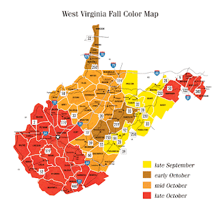
Fall is my favorite time of year with the leaves changing and all, so I liked this map Caroline posted.

Wednesday, November 21, 2007

Meh...I couldn't wait...

I changed a few things around and I think it looks MUCH better now...at least on paper and on the LCD monitor in front of me. I'll see what it looks like on the laptop when I get home!


Again, if your reading this let me know what you think...Happy Thanksgiving Everybody!!!

Pre-Final Project Proof...

Yeah, the Final Project "Proof" isn't due for like two weeks, but I had a few extra hours today so I figured I'd take a shot at starting my final project. Here's how it turned out...any comments, what you like/don't like, suggestions, advice, are welcomed.


I'd like to see ArcMap spit that out!

Ok well it sort of did spit it out...I pulled the basemap along with the roads off ArcMap. I'm really pleased with the way some of it turned out, I really like the layout for example. Looking at it on my laptop now though, there are several things that I notice that I need to change, like the road network needs to be a little darker. One thing I'm not so sure about is the size of my symbols. The seem a bit small, but at the same time I don't want them to be too much bigger because then I'll end with problems like the symbol for New York City/Newark completely covering New Jersey.

Monday, November 19, 2007

Lab 10...aka...What happens when you sleep through your alarm and miss 95% of class...

Here is my Lab 10 Bivariate map. From the USDA's website of all places, I found data at North Carolina's county level on poverty levels in each county and the level of education of each county.


Now that I've finished my map, I go back and look at the power point that I missed, and realize there are numerous problems with my map. First, the powerpoint says the data can be 2 different variables at the same point in time, or it can be 1 variable at 2 different points in time. Mine is two variables in two different points in time. At the end it also says that for this lab for a chorpleth proportional symbol map, use chorpleth for one variable (standardized data and proportional symbol for raw data. Mine didn't quite follow that I don't think...or did it? Also the spatial relationship patterns between the two variables turned out almost the opposite of what I was expecting/aiming for, I think because I used raw numbers instead of a percentage of each county's population for education levels. Thus the areas around Charlotte likely have larger symbols simply because theres more people there. I think had I done it by percentage of population it probably would have turned out different. Despite all this the Lab handout says...

"For this lab, the design will be key. Spend some time playing with the layout and positioning, eliminating white space, adding background fills and neatlines. Look for examples from printed maps, online maps (and any maps your classmates have found for the blog map posts). The map you turn in will be graded on aesthetics even more than the prior 9 labs…"

...and I think I did a pretty damn good job with that aspect regardless of my data flaws. So I'm just going to leave it as it is because this took long enough.

Tuesday, November 13, 2007

Cartotalk...

Hey I just wanted to share with the class this forum site I just found on the web. It's called CartoTalk and its basically just like any other online forum where people discuss Cartography and other GIS related issues. I haven't explored it much yet but it seems like a really good source of information. I added it to my links...check it out.

--Kevin

Saturday, November 10, 2007

Toto, I don't think we're in Kansas anymore...Lab 9!

Finally we get some color!


For this lab I tried to optimize my map so that it would look best in digital form. In addition to adding color I made several changes to the map from its original form from Lab 6. I changed the title so that it all fit on one line and shortened it so that income in dollars is displayed in the legend instead of the title. I think it looks cleaner this way. For the most part, the layout of the map is the same, but I did several things that I think make the map look much better digitally, i.e. shrinking the neatlines and using ones with rounded edges. I also used thicker lines for the state borders in order to try to make the main subject of the map more pronounced.
As far as color goes, I think the green color scheme I used works well for this map. Green = Money/Income. Plus I just like green (in case you haven't noticed). I selected the colors from one of the color legends from the all too easy, www.colorbrewer.org (hmm...I should add that site to my links). I actually changed the darkest color to make it a bit darker than what was originally given on the website because it was hard for me to tell the difference between the two highest categories. It is pretty dark but I think it works. I played around with different background colors but I found the grayscale gradient to work for me.
Looking at the differences between the map in digital and paper forms, the colors on the paper map seem a bit more...saturated maybe? The jump in darkness from the second highest to highest category doesn't seem as big on the printed map as it does on the digital map. I probably wouldn't make any major modifications to the map in trying to optimize it for either form. I might have made the scale bar a little bit thinner but thats about it.

So much for 3 or so sentences...and...We welcome you to Munchkinland!

Tuesday, November 6, 2007

Lab 8 - Dot Density Map...

Here is my Dot Density map for Lab 8.


I chose to map the dataset of the houses in West Virginia which were built in or before 1939. I arranged the dots so that they followed population patterns in each county.

Saturday, November 3, 2007

Dot Density Maps...

Here's two examples of dot density maps that I've pulled off the web. The first one is a map of the acreage of croplands harvested in the U.S. in 1949.


The second one is kinda cool. Its a map of Facebook usage for the month of April this past year.

Tuesday, October 30, 2007

Proportional Symbol Map...

Single? Maybe you should check this out...


I think the legend they used on this map is kind of cool. Anyway, the Strange Maps blog comes through for me again...I love that site.

Lab 7...Moo Moo

Here is my Lab 7, proportional symbol map.


Mmmmm...beefy.

Choropleth map...

I forgot that we were supposed to post up an example of a choropleth map to our blogs, so here it is...


No, I'm not Mormon (not that there's anything wrong with that), but I thought this was a good example of how a Choropleth map can really convey the geographic pattern of a topic being studied. It's easy to tell by looking at the map, that most of the Latter-Day Saints reside in the region around Utah (no suprises there). The map is one of a series of maps showing where different religions are largely located around the country. I think they are all solid, good quality choropleth maps. Heres the link...

http://www.valpo.edu/geomet/geo/courses/geo200/religion.html

Wednesday, October 10, 2007

Wednesday, October 3, 2007

Lab 4 - Harpers Ferry...


Now that wasn't so hard was it...

Wednesday, September 26, 2007

Use of Fonts...

Its amazing what Google can find if you just type in exactly what your looking for...say "maps with odd fonts."


This "map" I think is a great example for a map with good use of fonts. Though its not mapping locations or spatial data or whatever, I think it's clever the way the fonts sort of portray or reflect the subjects. Language is in sort of a calligraphic font. The Arts looks like someone could have just written it by hand with a marker. Technology is a more mordern, simple, cleaner cut, style font. So yeah.

This other map I got off the Strange Maps blog. I hate baseball but its another interesting way to use fonts in that each "country" is labeled with the logo font for each baseball team.

"Strange Maps" Blog

Hey all, I came across this blog called "Strange Maps" which has a lot of cool different maps old and new on all different subjects. Just thought it was kind of cool, if you haven't seen it before you might want to check it out... I added it to my links.

--Kevin

August's Conformal Projection of the Sphere on a Two-Cusped Epicycloid...


Yeaahhh...what this guy says...
http://members.shaw.ca/quadibloc/maps/mcf0702.htm

And heres the home page...
http://members.shaw.ca/quadibloc/maps/mapint.htm

Earth as a Geoid...

This is more related to our second lab but I thought it was really cool. It's sort of a 3-D image of the Earth as a geoid...


Heres the link to the website that I found it at, click on the link under "The Earth"...

http://postgis.refractions.net/pipermail/postgis-users/2005-May/008070.html

Saturday, September 22, 2007

Because I can...

Even old New York, was once New Amsterdam...


Why they changed it I cant say, people just liked it better that way!

Thursday, September 20, 2007

Lab 3...

Mollweide Graticule...

Tuesday, September 18, 2007

Friday, September 7, 2007

Links thus far...

The links I have posted as of now all should be relevant to class. Geography 310 Blog and GMU Dept of Geography are self explanatory.

GoogleEarth - GIS in its simplest form. If you don't have it on your computer yet you should. You can do all kinds of stuff with it. Look up your house, George Mason, the Egyptian Pyramids, New York City...whatever. Turn on and off different layers to show boundries, roadways, rivers, national parks...all kinds of stuff. Downside is some of the images are quite outdated. My house for example shows my dads old car sitting out front which he sold almost four years ago!

World Sunlight Map - Map of the globe which shows where on earth the sun is shining and where its night. Updated every hour...I think. I thought it was kind of cool at least.

World Maps - All kinds of different maps of places throughout the world. Should be good for finding maps for our weekly assignments.

Earth Album - GoogleEarth mashed up with Flickr. Click on a place on the globe and it shows you different pictures of or taken in the location you clicked on.

StumbleUpon - For those of you using Firefox this is a really cool extension. It's especially fun if your bored and have nothing else to do. You put in your different interests into your profile and then you can click on the stumble button. It takes you to different random websites other people have flagged who have the same interests as you. I chose geography as one of my interests and I've found all kinds of cool geography sites. World Sunlight Map, World Maps, and Earth Album I found using this tool. I came across another cool one that I forgot what it was but it was a real time map of the globe showing seismic activity throughout the world. Pretty cool.

Thursday, September 6, 2007

Allow me to introduce myself...

Hey people, now that I've got my picture up I figure I should give a little info about myself before I actually start on the assignment posts. My name is Kevin, I'm 23 and I'm finally a senior! I'm a history and geography double major and no...I don't want to teach so don't ask me! I'm not sure exactly what I want to do after I graduate but hopefully I'll figure it out soon enough. My historical interest lie mostly in 20th century world history, with a particular interest in the Soviet Union and the Cold War. I'm also somewhat of a WWII "buff" if you will. I really enjoy traveling and learning about all different kinds of places. This past March I had the chance to visit Russia! My profile picture I took of myself just outside of Red Square. My favorite place I've been to so far is Vancouver, BC. I spend most of my free time doing the two things I love most...hanging out with my girlfriend or riding my mountain bike.

Me Picture...